In my project, I gathered example data of supermarkets from Kaggle Dataset and took ideas from online for making the Dashboard. I took concepts from online and tried to
implement with my ow thinking and color combination, while also modifying
some of the terms and conditions to fit my project. After modifying Excel data with a PowerBI query,
I generated an interactive dashboard here. In addition, I modified a few columns and established measures
in order to make the dahboard easily readable and apparent. This project taught me a great deal, including
complicated colour operations and condition. THankyou
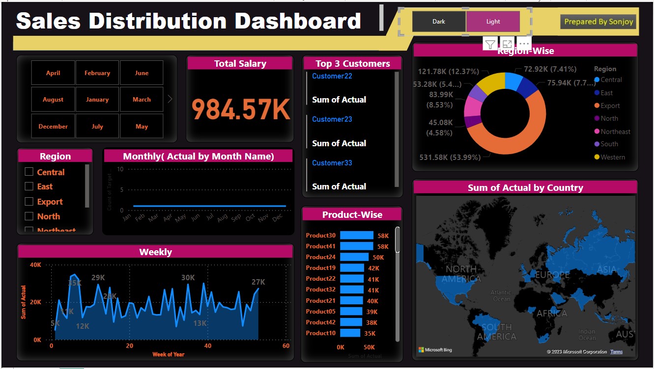
This project is a Sales Distribution Dashboard in which I have categorised and visualised crucial data from a large dataset.
Here, I've been attempting to learn more about theme customization. In this project, you may choose your theme by choosing
dark and light at the top of slicer. This project's colour combination is one of its most important characteristics,
and I've developed a number of methods for selecting title colour, font, and backdrop from the colour combination function.
The most impressive aspects of this dashboard are the Map region-by-region donat graphic and the month-by-month
data presentation. In addition to displaying data on a weekly and monthly basis, you can also view the top three consumers
for each time period and selection.
Thankyou
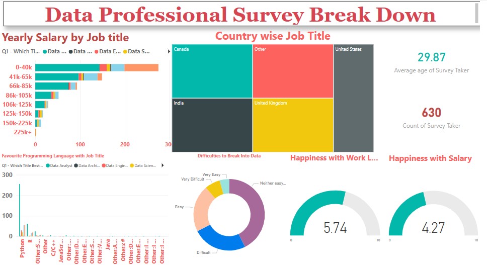
In this project, I collected data from Kaggle categorising professional data by job title, using professionals from various regions and countries to illustrate the breakdown
of their work. By selecting the year and other criteria, this dashboard makes it simple to determine how many data analysts are employed in India or other nations.
I attempted to replicate elements from YouTube precisely as they were, while also altering some of the terms and restrictions to fit my project. Using a PowerBI
query to edit Excel data, I produced this interactive dashboard. Additionally, I updated a few columns and set measures to make the dahboard easily visible and evident.
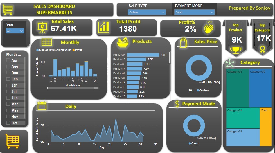
In this project, I created an interactive dashboard for supermarkets that displays the data for Total Sales, Total Profit, Profit Percentage, Top Products,
and Top Product Categories. Concurrently, I utilised various forms of visualisations, including slicers, bar charts, cards, clustered bar charts, and donut
charts, as well as a variety of functions for displaying average and categorised items. This project has taught me how to build a dashboard with an effective
colour scheme and interaction. Besides, I've used a background image of canvas that I generated in PowerPoint, and then I've altered it and organised
some icons for enhanced chart visualisation. THankyou

Next project of POWER-BI is coming Soon.
Next project of POWER-BI is coming Soon.